- Home
- Case Studies
- Case Study Before-After
Nobody will be surprised to learn that a website that focuses on user experience is absolutely critical in this day and age. A well-designed website boosts your search engine rankings and enhances your credibility among your competitors.
At Admen, when we take on a new client, one of the first things we do is check out their website. We want to learn who they are, what they do, and what sets them apart from their competition.
Unfortunately, we’re frequently disappointed. And if we’re disappointed, how do your customers feel? Poor design, weak copy, and clunky navigation are just a few of the mistakes brands make online — but that’s okay!
Your website is often the first touch-point a client will have with your business. How does it measure up? Let’s review some first impressions and how they measure up against their new, lasting ones!
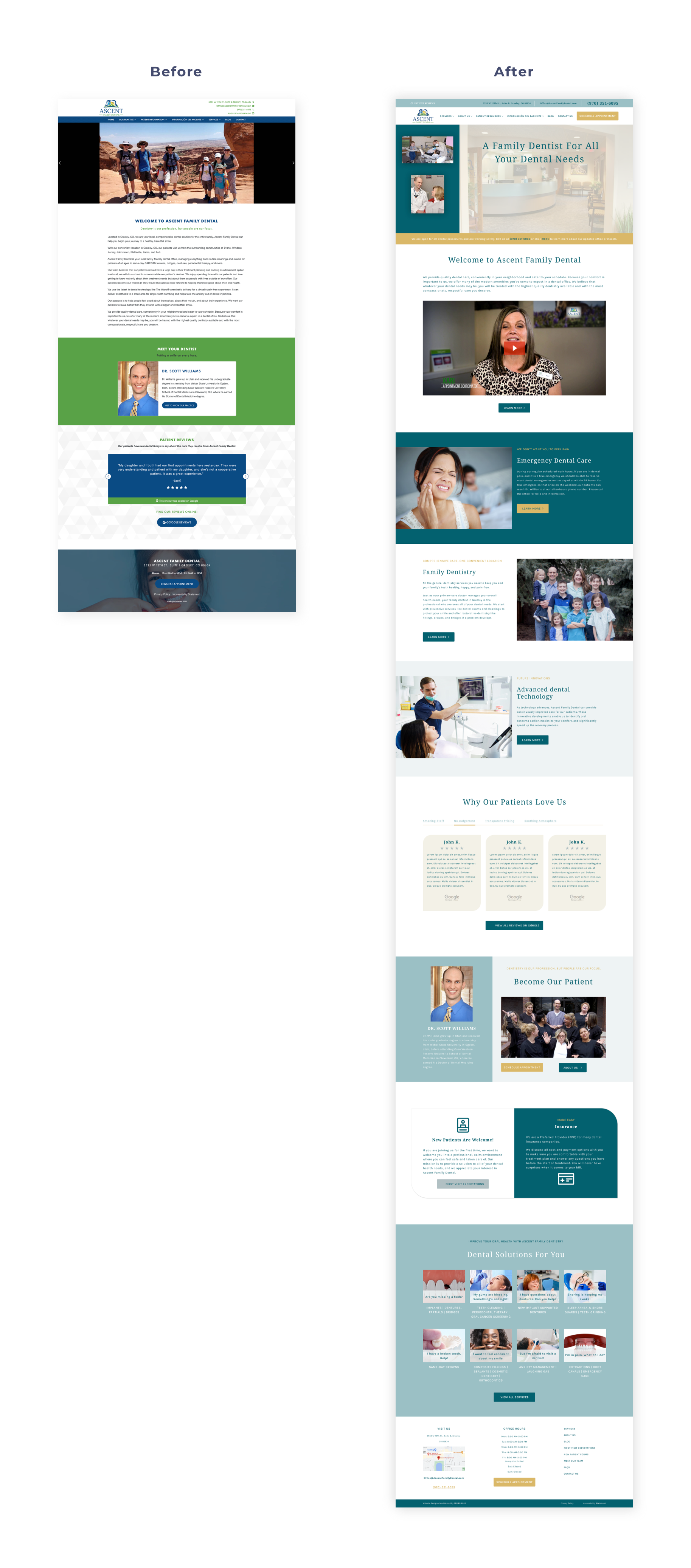
The Client: Ascent Family Dental
On the original homepage for Ascent Family Dental, it was difficult to determine what services they offered. In all honesty, it was difficult to tell if it was a dental practice at all.
The Before
Most of their dental services didn’t make it on the drop-down menu. Existing and prospective patients had to get through as many as four or five mouse clicks to find the treatment they needed.
The original website was not designed to be mobile-friendly, which is a huge turn-off for new customers who are frequently looking for services on their phones. It also lacked cohesion with the new modern look and feel of its rebrand.
Ascent Family Dental’s decades of experience were one of the most valuable assets in their practice, but this information was lost in the chunks of text-heavy content.
The After
The Admen created a modern, sophisticated design that matched Ascent Family Dental’s prestigious practice, giving it the credibility their office deserved. We also solved their critical usability by re-configuring how the information was structured. Then, we enhanced navigation by simplifying the menus and providing additional links.
Ascent Family Dental’s new website was designed with their end-user in mind and their marketing goals as the driving force. Working with our marketing team, we added more call-to-action buttons and key, relevant blog articles to boost their Google search engine rankings.
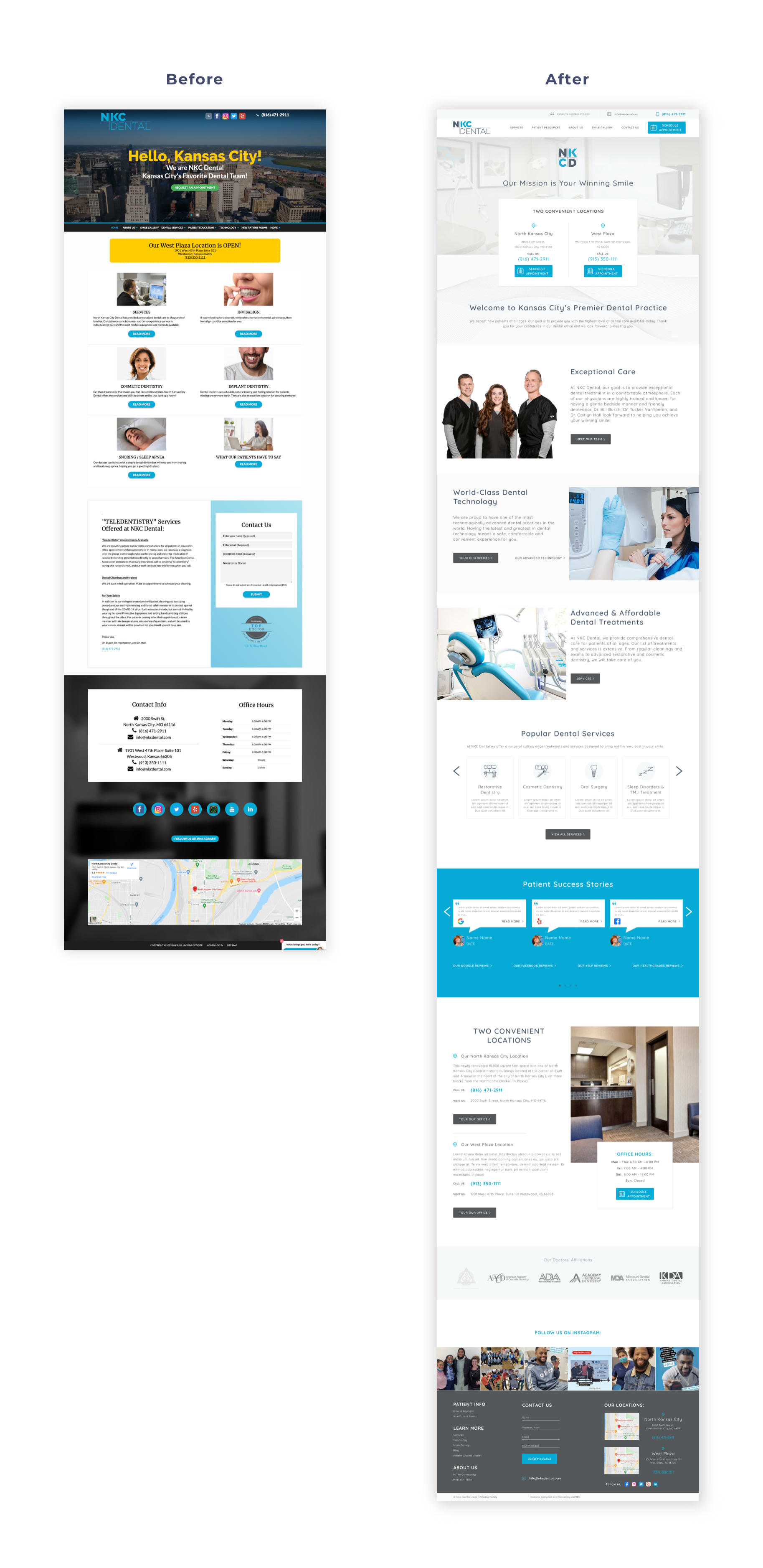
The Client: NKC Dental
NKC is not your grandma’s dental office. It’s a high-end, high-tech dental practice featuring the technologies of tomorrow, but you would never be able to tell any of that from their old website.
The Before
NKC Dental’s previous website had no fewer than six drop-down menus stuffed with a plethora of links. Visitors were easily lost in a sea of buttons and inelegant, text-heavy blocks of information. And mobile users were just as frustrated. None of these issues created a website that matched their refined, innovative practice.
The After
We reformatted the complex navigation to improve user experience on both a desktop and a mobile device. We also pared down the heavy blocks of text to highlight the most relevant elements of their messaging.
Restructuring the content allows us to bring to the forefront NKC Dental’s innovative approach and advanced dental technologies. This resulted in a clean and modern look to properly reflect their high-end dental practice in North Kansas City.
The Admen team wasn’t just thinking of the patients! We also took care of the staff by incorporating automated systems to make office life easier. We integrated an online scheduling system, live chat support, and online payment processing. We even synced their Instagram feed.
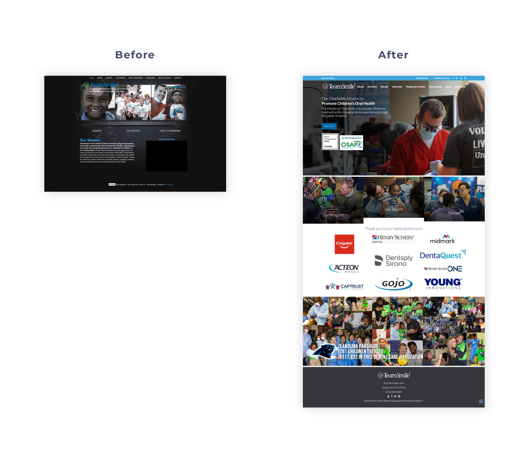
Another area where NKC Dental also shines is their community involvement and close partnership with the “Team Smile" charity, where practice owner Dr. Busch is a co-founder. Not all of their patients even knew of this office’s generosity in giving back to their community.
The Admen team knew the marketing power of this charitable work and convinced them to tastefully showcase it on their website. We created a “Community Involvement” page that communicated how the cost for services was paid forward into the community and actively made a difference.
The new NKC Dental website now spotlights the beautiful dental work, years of valuable community reputation, friendly staff, exceptional care, and the latest technology through bold images and strategic design for the greatest impact on visitors.
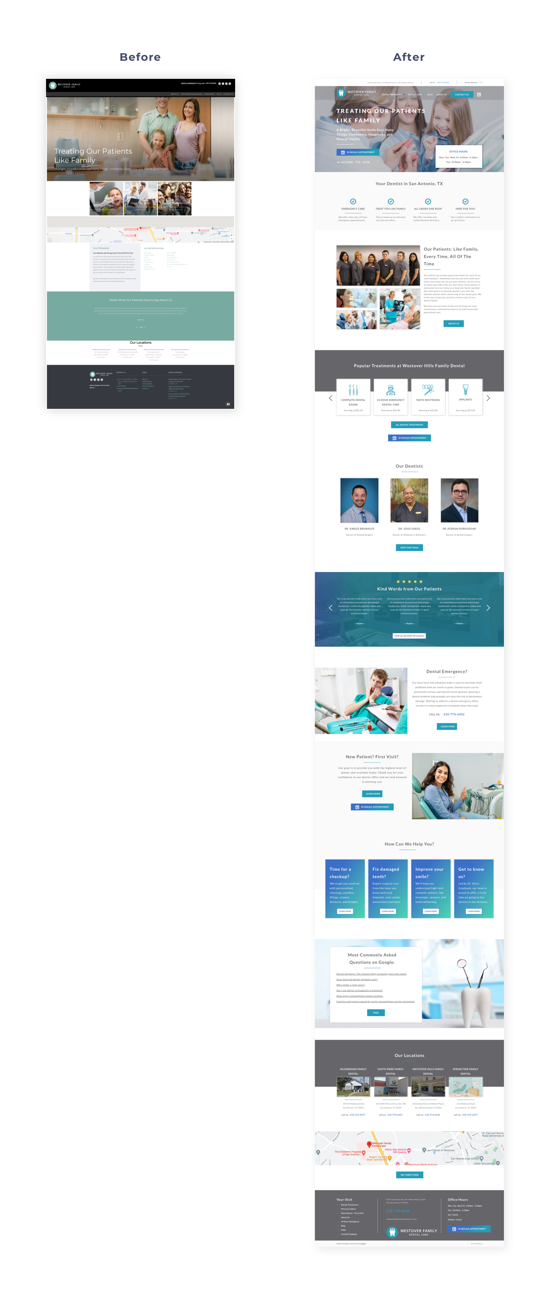
The Client: Westover Hills
Dr. Shiva Izzadust owns four dental practices, including Westover Family Dental. All four websites had one or two elements that make up a successful website, but none included them all. And what we did find wasn’t well-executed.
The Before
Outdated and clunky, the old site lacked cohesion with the branding and offered a poor user experience on desktop or mobile views. All of the pages were primarily text-based, making them difficult to process, and its amazing reviews were buried deep within the website.
The After
By creating a site map that was easy to navigate, we designed a natural flow for the user journey that was more mobile-friendly. We pared down their messaging to highlight what sets them apart and transformed pages from text-based to image-based. Adding engaging video content also enhanced the user experience and brand image.
Now, the new home page features user-friendly navigation and showcases its many amazing reviews. The company’s services and impressive work are prominently displayed in a way that encourages quick action. How patients can expect to be treated at this warm and family-oriented office is reflected in every aspect of the website.
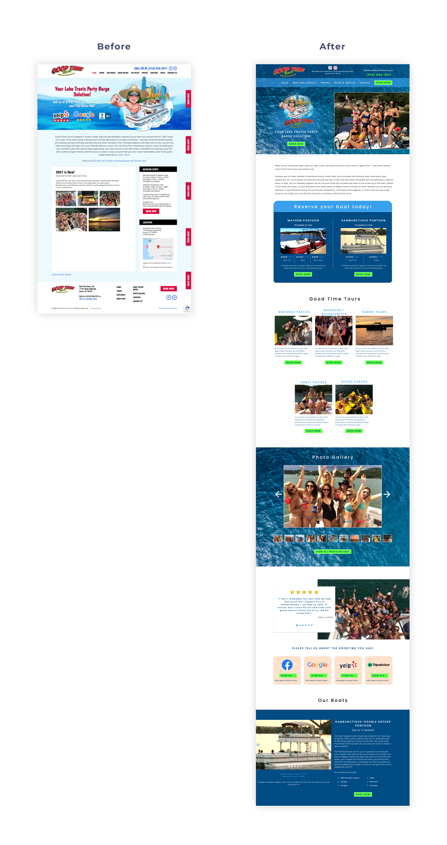
The Client: Good Time Tours
For a thriving business with a large client base and tons of visitors per day, Captain Kris’s website still looked like it did in the early 2000s.
The Before
Good Time Tours is not your average tour company. They’re fun, unforgettable, unique, and exciting! But you’d never get that from the website. It was outdated, it underperformed, and it was difficult to navigate.
The After
The Admen team had to deliver the energy of a “good time” through a complete website redesign that still utilized some existing brand elements. This meant enhanced, cohesive branding, improved readability, and simplified navigation. We also created an interactive map to show future visitors the incredible services that Good Time Tours provides.
Essentially, we built a time machine to bring this website into the current decade and beyond.
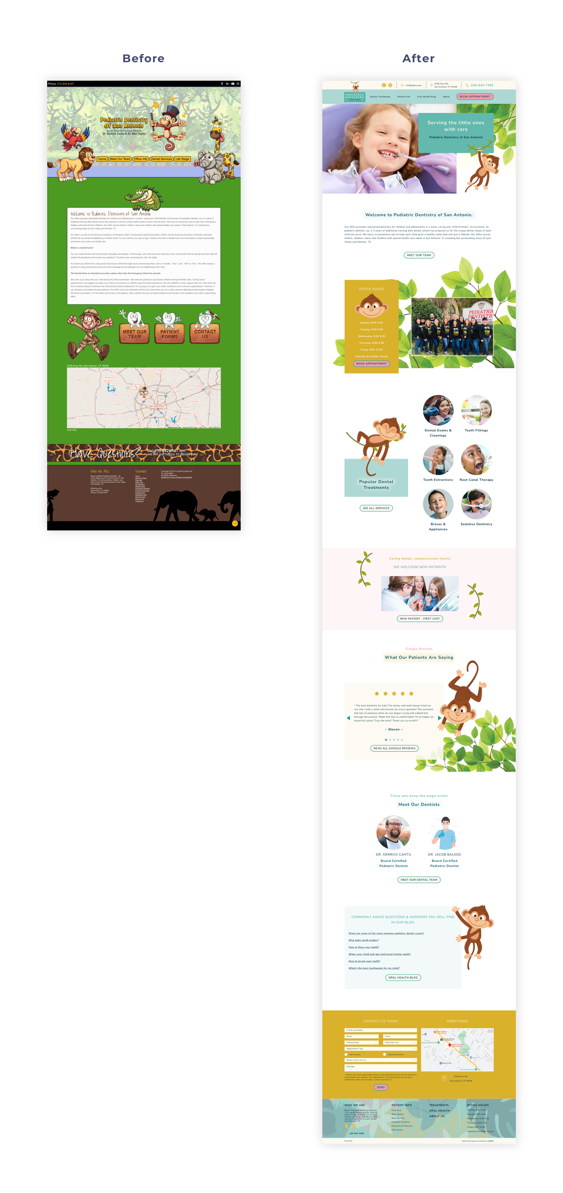
The Client: Pediatric Dentistry of San Antonio
The pediatric dental industry has undergone massive changes to bring new technology and comfort for little children when visiting the scary dentist office. But you’d never know it looking at Pediatric Dentistry of San Antonio's old, scary website.
The Before
The original e-commerce website was built on an old platform with limited functionality and not enough customization options. It featured static design elements that were limited to a single rectangular space. With few products on display, small images, and very little movement, the website felt like a disservice to the company.
The After
Enter the Admen team! We designed a modern, responsive website to welcome new patients and make little ones feel comfortable about hopping in the dental chair. We incorporated recent photos of smiling children along with a funny little monkey that follows you around the website.
Now it’s the good kind of digital jungle! If they accepted adult patients, I would go there right now!
There is also a redesigned blog section that offers practice and service information to help boost search engine rankings. Add in a few stellar testimonials and enticing calls to action, and their new website creates a memorable connection with potential and existing patients.
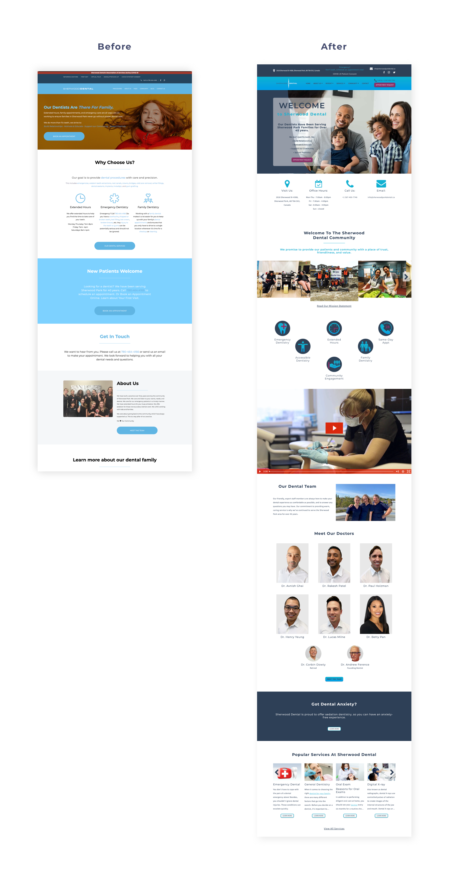
The Client: Sherwood Dental
The first click was obvious. Sherwood Dental’s website needed a total overhaul.
The Before
There was little to motivate parents of tiny patients to call this office after arriving at the text-heavy website with outdated photos and antiquated navigation. It was a digital jungle.
The After
The Admen team helped Sherwood Dental establish a new brand identity and defined key messaging. This led to a bold visual direction for its custom website.
Now it’s clear who Sherwood Dental is, what they do, how patients benefit from its services, and what sets it apart from the competition. The home page now features a moving video on the home page, bold calls-to-action, inspiring testimonials, and easy navigation.
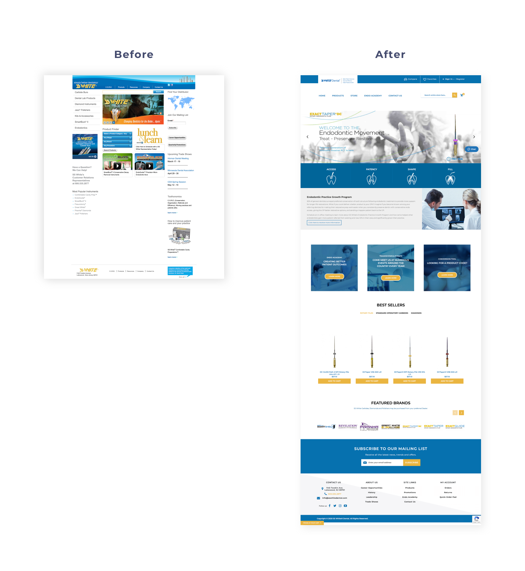
The Client: SSWhite
SSWhite first came to Admen for SEO services and website redesign, but we quickly realized starting from scratch was absolutely necessary.
The Before
Text-heavy and seriously outdated, the website lacked mobile-friendly design and intentionality. Small, low-quality images neglected the story of the company’s family-oriented culture and premier services.
The After
The widely imaginative group of designers and developers that make up the Admen team created a client-friendly website that prioritized sales and an enhanced user experience. We incorporated negative space and clean, simple fonts that elevated the overall look and feel of the brand.
With the new call to action buttons strategically woven throughout the website, customers can now easily navigate each page and find everything they want. The end result is not only a huge success for Admen, but for one of the largest endo e-commerce businesses with over 250 employees and worldwide distribution.
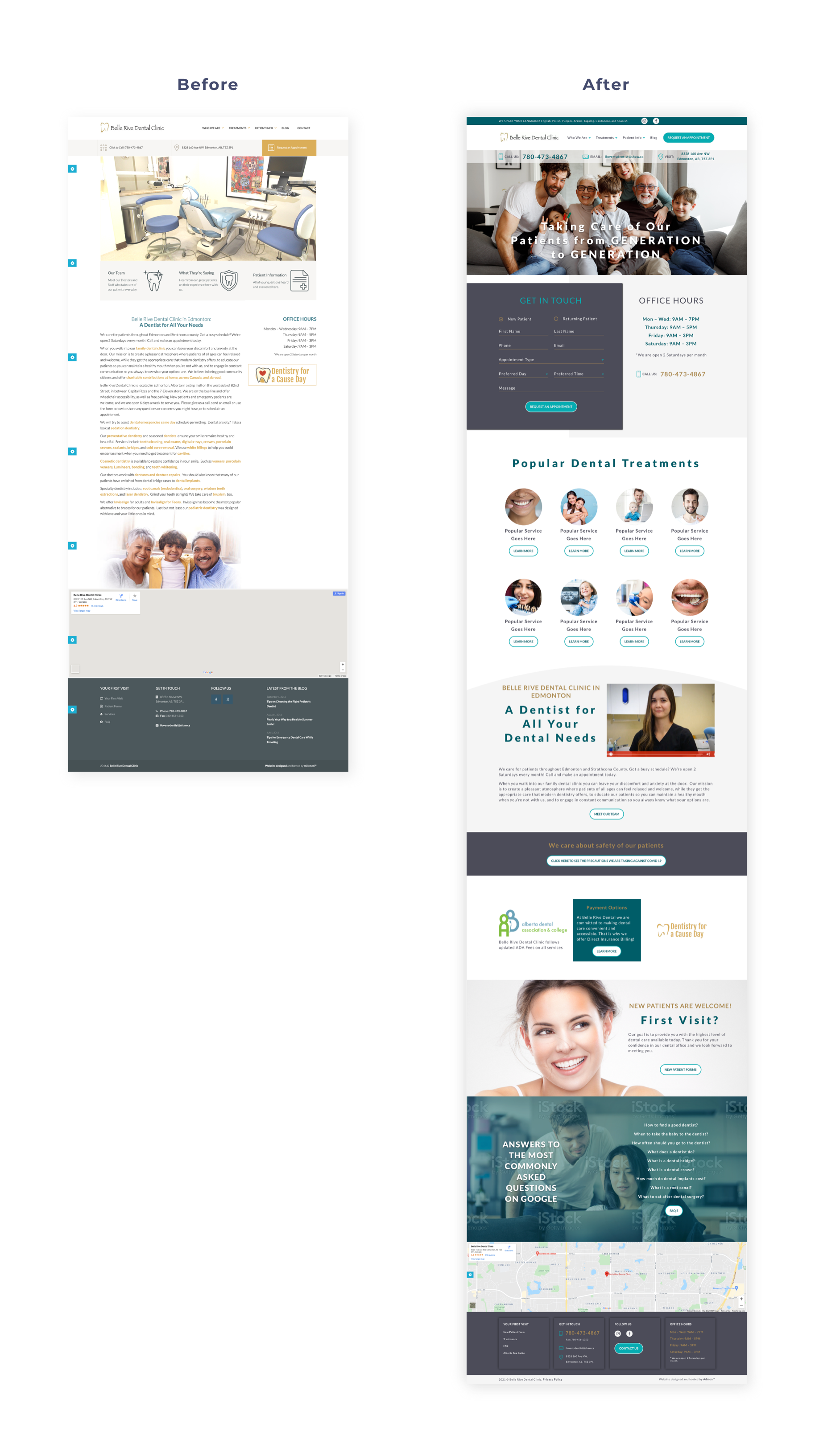
The Client: The Belle Rive Dental
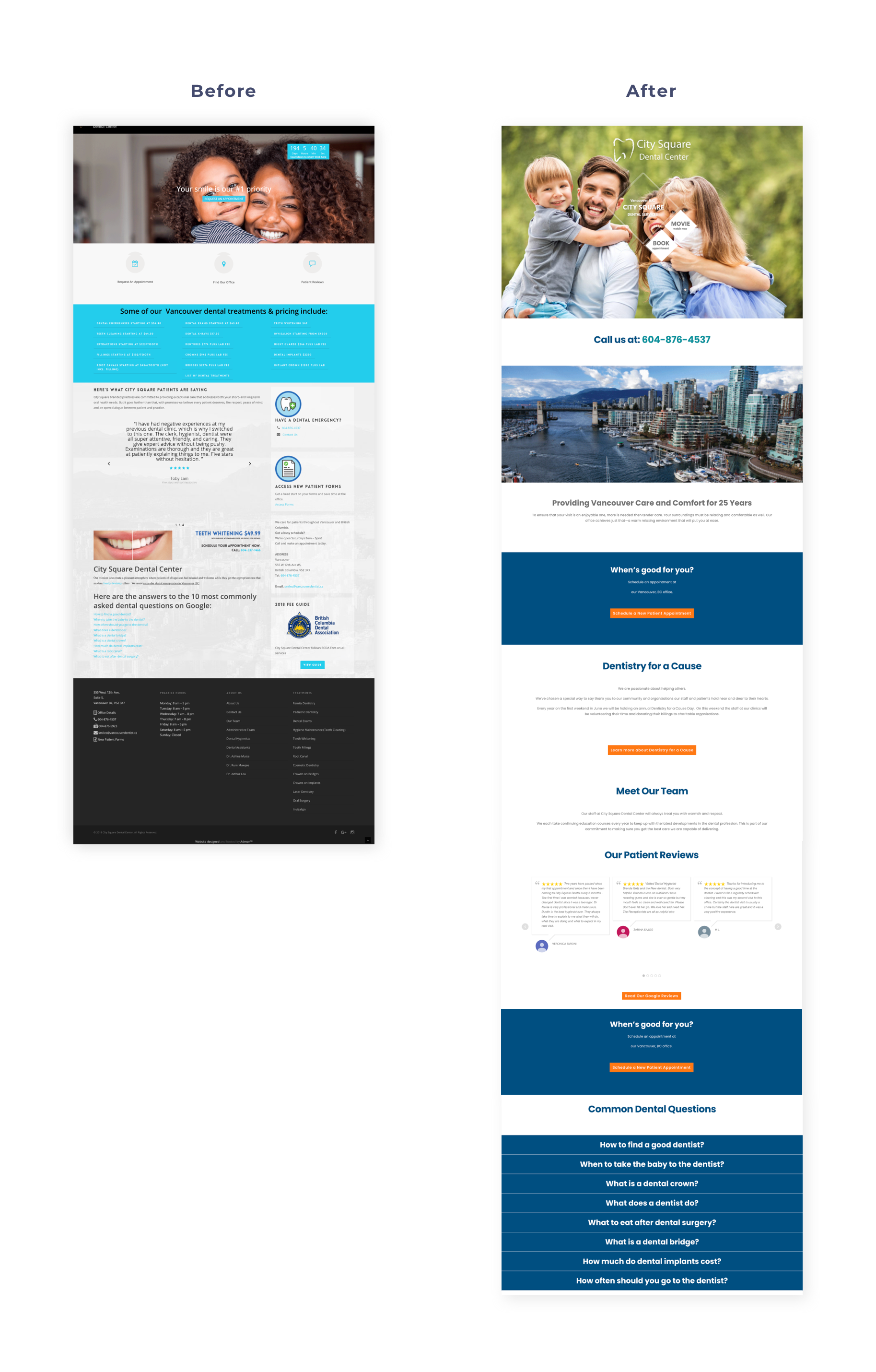
The Client: City Square
The Client: Team Smile
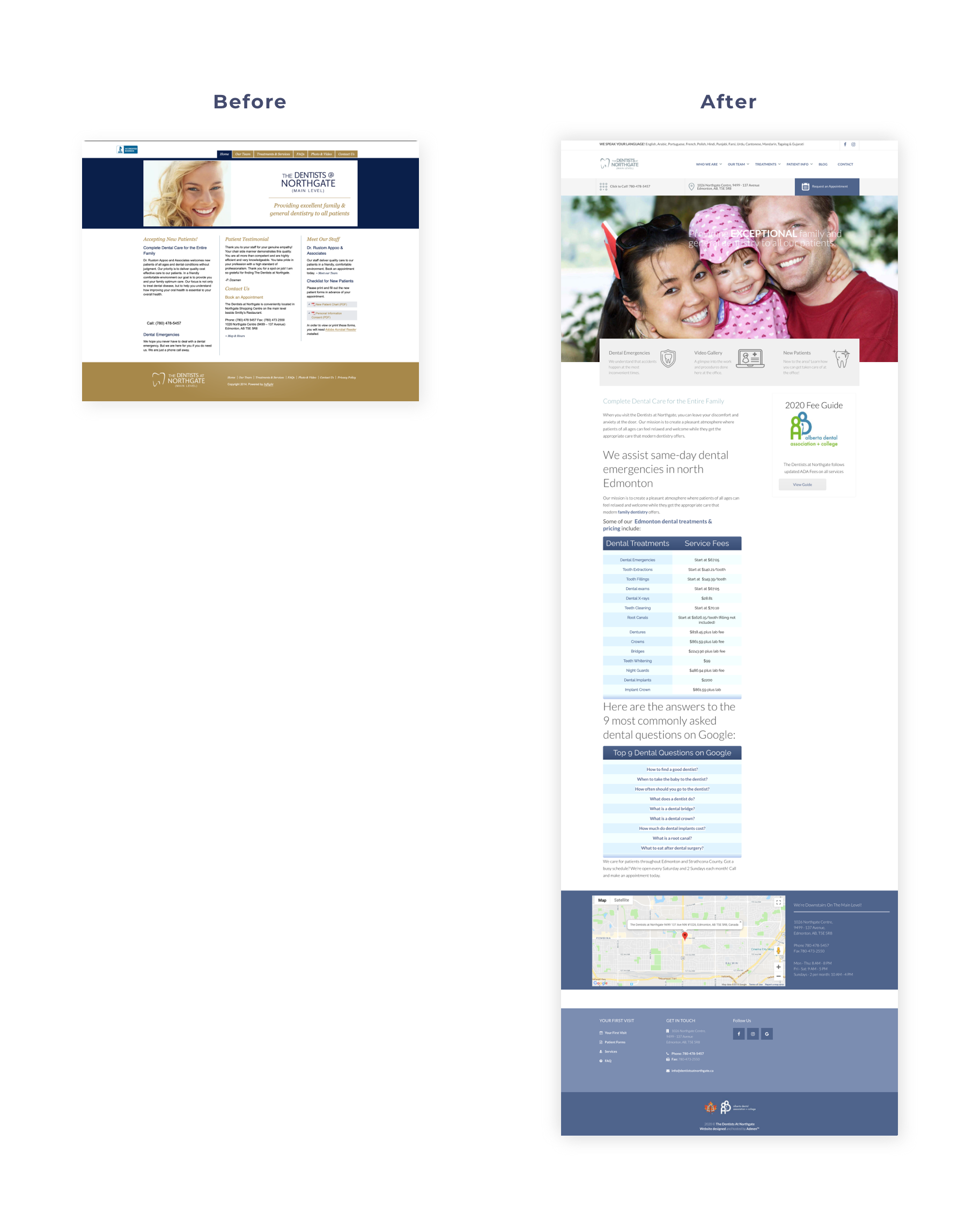
The Client: The Dentists at Northgate